
LINEARZ BRANDING & VISUAL IDENTITY DEVELOPMENT
“Linearz” is a device that uses cartridges to deliver ultrasonic waves to lift and sculpt every layer of the skin.
It has two modes: Linear & Dot, and varied depth control.
HEAZ has designed Linearz’s brand mood, logo, symbols, and visual guide.
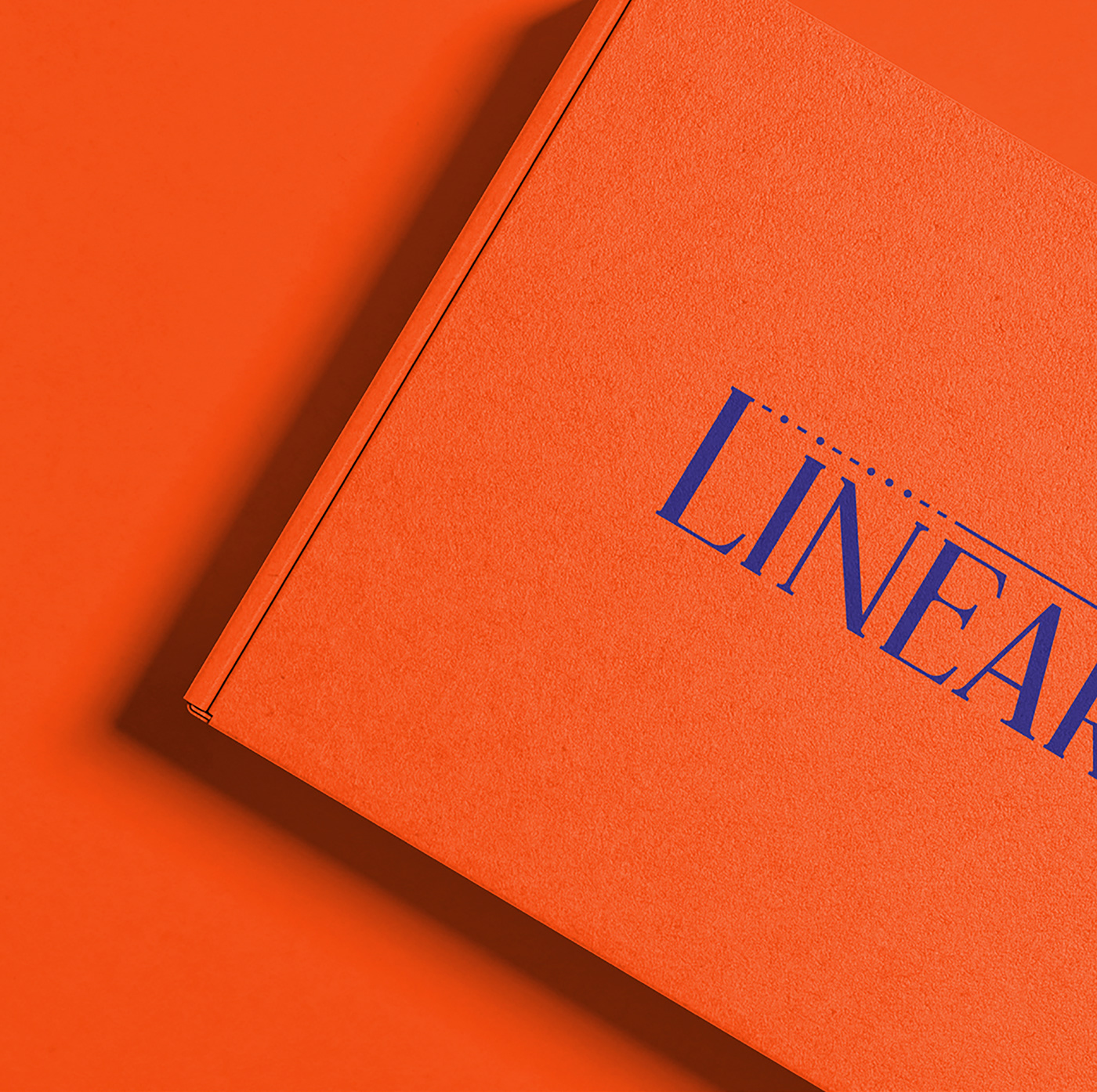
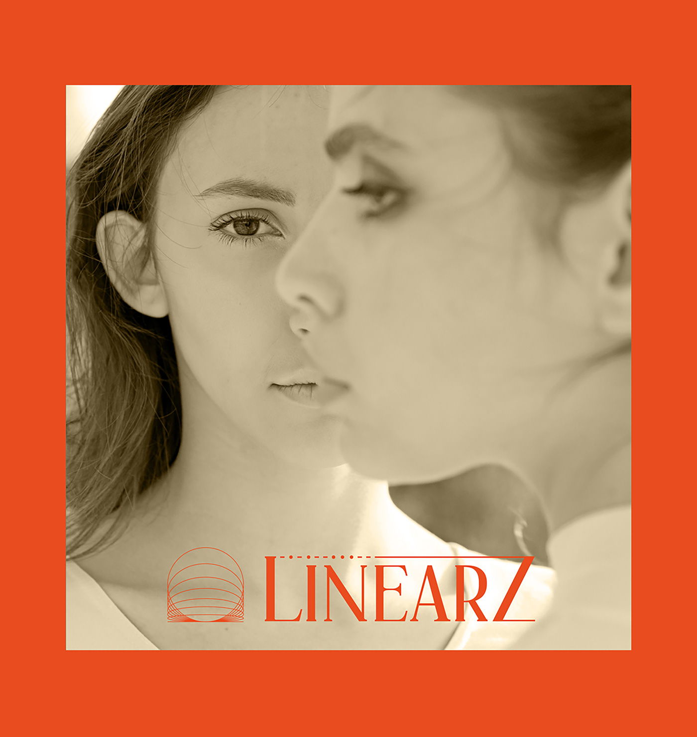
In the logo, the linear & dot modes of the cartridge are intuitively expressed, while the accompanying symbol visualizes
a cross section of skin that represents the several dermal layers.
The brand’s key colors are a contrasting cobalt blue and orange, which conveys a refined yet impactful mood.
Client. Jeisys
Year. 2022
Brand Location. South Korea
Art Director. Sangchul Won
Designer. Haeseul Joo, Eunhye Nam
Photographer. Junghun Yeom


